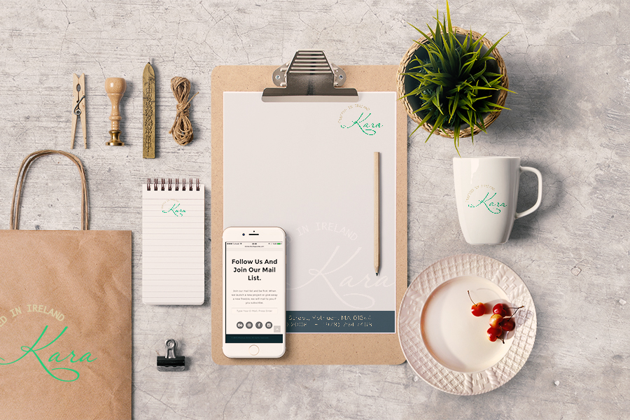
Branding is the perceived emotional corporate image as a whole. It is certainly not a light topic – whole publications & hundreds of books have been written on the topic. However, to put it in a nutshell, you could describe a ‘brand’ as an organization, service or product with a ‘personality’ that is shaped by the perceptions of the audience. On that note, it should also be stated that a designer cannot “make” a brand – only the audience can do this. A designer forms the foundation of the brand.
Many people believe a brand only consists of a few elements – some colours, some fonts, a logo, a slogan and maybe some music added in too. In reality, it is much more complicated than that. You might say that a brand is a ‘corporate image’. The fundamental idea and core concept behind having a ‘corporate image’ is that everything a company does, everything it owns and everything it produces should reflect the values and aims of the business as a whole. It is the consistency of this core idea that makes up the company, driving it, showing what it stands for, what it believes in and why they exist. It is not purely some colours, some typefaces, a logo and a slogan.
As an example, let’s look at the well known IT company, Apple. Apple as a company, projects a humanistic corporate culture and a strong corporate ethic, one which is characterised by volunteerism, support of good causes & involvement in the community. These values of the business are evident throughout everything they do, from their innovative products and advertising, right through to their customer service. Apple is an emotionally humanist brand that really connects with people – when people buy or use their products or services; they feel part of the brand, like a tribe even. It is this emotional connection that creates their brand – not purely their products and a bite sized logo.
Identity is the visual aspects that form part of the overall brand. One major role in the ‘brand’ or ‘corporate image’ of a company is its identity. In most cases, identity design is based around the visual devices used within a company, usually assembled within a set of guidelines. These guidelines that make up an identity usually administer how the identity is applied throughout a variety of mediums, using approved colour palettes, fonts, layouts, measurements and so forth. These guidelines ensure that the identity of the company is kept coherent, which in turn, allows the brand as a whole, to be recognisable.
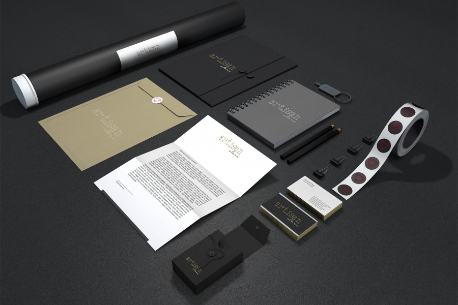
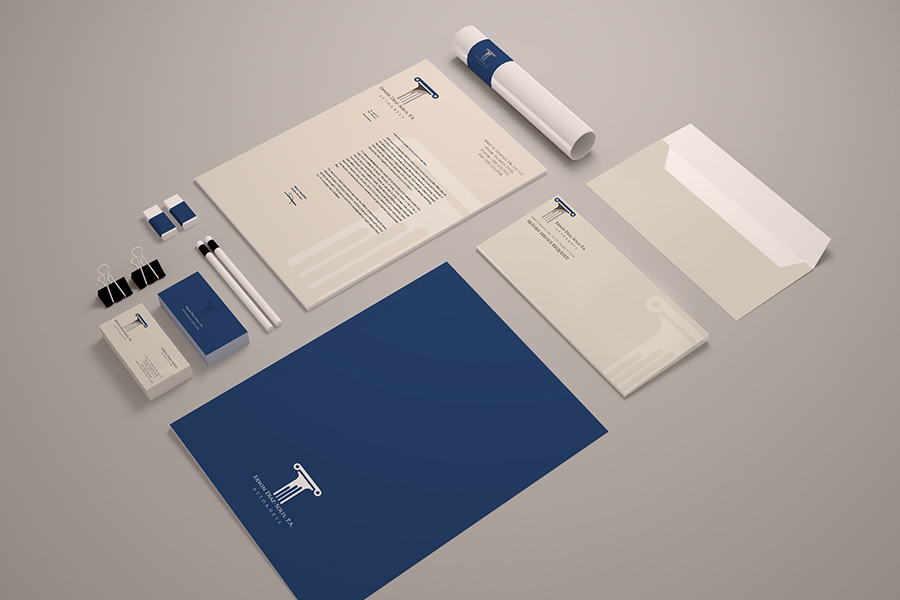
The identity or ‘image’ of a company is made up of many visual devices:
All of these things make up an identity and should support the brand as a whole. The logo however, is the corporate identity and brand all wrapped up into one identifiable mark. This mark is the avatar and symbol of the business as a whole.
A logo identifies a business in its simplest form via the use of a mark or icon. To understand what a logo is, we must first understand what it is for.
A logo is for… identification. It identifies a company or product via the use of a mark, flag, symbol or signature. A logo does not sell the company directly nor rarely does it describe a business. Logos derive their meaning from the quality of the thing it symbolises, not the other way around – logos are there to identify, not to explain. In a nutshell, what a logo means is more important than what it looks like.
To illustrate this concept, think of logos like people. We prefer to be called by our names – James, Dorothy, John – rather than by the confusing and forgettable description of ourselves such as “the guy who always wears pink and has blonde hair”. In this same way, a logo should not literally describe what the business does but rather, identify the business in a way that is recognisable and memorable. It is also important to note that only after a logo becomes familiar, does it function the way it is intended to do much alike how we must learn people’s names to identify them.
The logo identifies a business or product in its simplest form.
Wordmark – A stylized type that may include small abstract or pictorial elements e.g. Coca-Cola
Pictorial Mark – A literal or representative imagery used to symbolize the brand e.g. Apple, Inc.
Abstract Mark –Abstract shapes and symbols used to convey an idea or feeling e.g.
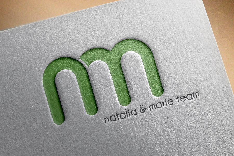
Letterform Mark – A monogram usually consisting of 1-3 letters e.g. Louis Vuitton, Chanel or Gucci
Emblem – A badge that usually envelopes the logo e.g. UPS
Character –A mascot that represents the brand e.g. Starbucks’ mermaid